Monday, December 14, 2009

Service Redesign: Insomnia Cookies


Insomnia Cookies Website

Insomnia Cookies is a fun new take on late-night food delivery service. Starting in UPenn’s campus, Insomnia had humble beginnings as a dorm to dorm student run late night cookie service. It soon got big and became a chain store throughout many big name college campus’s up and down the east coast. It’s popularity grew so much that they also integrated the use of food cart type trucks that you can find specifically on Temple’s campus. The best and greatest part about this place is that it’s open late. The store is open 11 AM - 1 AM and the delivery service runs from 7 PM - 2 AM. Not only do they have cookies but they also have brownies, ice cream, & of course ice cold milk. This is a great alternative to other late night food places that have the typical pizza, Chinese food, etc. etc. I love this place and frequent it at least once a week. Since their delivery service only runs from a certain point of radius I’ve only experienced their in-store service. There are a few problems with that. As of right now, they only take orders via the internet and at a $6 minimum whether or not it’s pick-up or delivery. One time I showed up & was told that i would have to place an order on-line because they didn’t have any cookies. There are just a lot of things that don’t make sense as far as ordering goes with this place. One time I placed an order online & since I was already signed up, my order went straight through without asking me what kind of payment I wanted to use (cash or credit). I had entered my credit card info so i assumed my order was paid for. When I got there, they looked at me like I was crazy. So I had to go find an ATM. Also they’re customer service is awful. Lots of inconveniencies for no reason. So the main concentration of my service redesign was on Insomnia Cookies ordering process. I plan on making ordering simple, easy, and fool-proof. Also utilizing the phone service as part of the ordering process.


Wednesday, October 21, 2009

Learning Log 6.2: The Magic Mouse

I remember our class talking about Apple's mouse design and saying how it wasn't necessarily a good design. I disagree and think it is. I like the fact that Apple & it's products give you the option of scrolling left/right up & down. The sleek design is comforting on the hand & clicks the way you expect it to.

Apple has only recently introduced the new Magic Mouse. It has virtually no buttons except for it's entire body. Magic Mouse features a Multi-Touch surface with gesture support. It likes the Mac trackpad, allowing you to swipe, scroll, such as: scroll in any direction with one finger, swipe through web pages and photos with two, and click and double-click anywhere. It's also wireless.

Another great and unique feature that the Magic Mouse has is that you can customize your mouse to be comfortable and easily usuable for those who are lefthanded.

Learning Log 6.1: Design Research & Brainstroming

For our next assignment, this chapter seems very appropriate. I have yet to really strategize on how I am to go about doing my research for this project. This chapter was very useful. I learned some very useful facts such as focus groups are NOT reliable. It is vest to be camouflage when doing your research. The best way to really observe is to become your environment. I learned that when I had my Observing Humans class sophomore year. I had to take notes and watch my surroundings at the nearby Starbucks. It wasn't actually until i got comfortable and looked like a customer with my cup of coffee and laptop out that I had good concise research.

Wednesday, October 14, 2009

Leanring Log 5.2: The Dyson Air Multiplier

It's a shame I already had show & tell because I would have really liked to discuss this with the class. Only a few days ago did James Dyson (man behind the rolling ball vacuum) reveal a new design for the standard desk fan. The standard fan is pretty clumsy although it has worked! The only problems are dirty blades, some-what dangerous if the cage falls off, & heavy immobility. They also take up some unnecessary space.

The Dyson Air Multiplier Fan has no external blades and the device draws air into the upright cylinder portion of the fan via vents on the base. The air is then funneled out through a ring that sits atop the base. The cool air is blown out of vent hidden around the ring giving the illusion that the air is being blown at the person from nowhere. According to Dyson, the fan provides a better experience than traditional fans that product uneven air circulation and collect dirt on the blades.

I think this is a great step in the right direction for improvements in technology. A safer & more efficient design was definitely needed in the world of air cooling systems.

Learning Log 5.1: New Uses For Color


As soon as I started reading this article one thing came to my mind: food. Maybe it's because it's 12 noon and about that time for lunch. But the real reason is because it reminded me of the physiological study of color being directly related to humans appetite. Certain colors induce hunger.


If you take a look at a number of your favorite fast food joints, they use the colors red & yellow most readily in their interiors, exteriors, and logo design. These warm colors give us a sense of comfort and warmth. Red instantly attracts attention and it also makes people excited, energetic, and increases the heart rate. Red seems to have color dominance with regards to actual food products, as well. If red foods such as tomatoes, strawberries, and apples aren’t a natural part of the product, often times red packaging is used instead, such as with Coke, Skittles, and Campbell’s Soup. Red has also been linked to be effective in impulse buying. I think McDonald's has instilled in our head that their golden yellow arches mean tasty golden french fries. Yellow also is an attention getter.

Tuesday, October 13, 2009

Project 1: Redesigning "Buttercream Philadelphia"

I decided to redesign the website for Buttercream Philadelphia, which is the home of the cupcake lady. She rides around in a postal truck that's decked out in vinyl sprinkles & sells cupcakes out of her movable shop window. The website for it though is very poorly designed. Too many links & too much space. This site needs some condesing and a fun, simple make-over.

The cupcake lady (or Kate) likes to put a lot of non-sense information that makes this website feel 'homey'. That's the idea though, home-made cupcakes, from scratch. That doesn't mean the site has to be like that. I basically lessened the amount of links and dumped what was unnecessary like ramblings, pictures, & the fact that it takes a year to scroll down to the bottom of each page. Less is more! By reducing bulk, this website is easier to navigate & articulates information much better.

BEFORE

AFTER
I'm basing my redesign off of two other Philadelphia pastry shops websites. Although I complained about Naked Chocolate's website previously, I appreciate their aesthetic–simple, clean, white display. There lack of information & accessability is my only concern. I am more basing my information distribution (and somewhat design) on Brown Betty Dessert Boutique. Unfortunately Brown Betty's website is currently down but I will be sure to post a screen shot as soon as it's back up. UPDATE: Brown Betty's Website


Wednesday, October 7, 2009

Learning Log: Not Enough Info Naked Choclate Cafe

There are websites with too little information. Enter: nakeddchocolatecafe.com. Oh lord, days ago I had ordered a dozen cupcakes & a cake for my room mates birthday. The only way I got any contact information for the store was because of informative guide sites like Yelp & Yellowpages. When you go to Naked Chocolate's website, there is literally no information. There are no buttons to click, there is no way to know where it is or how to reach them. Also there are at least 3 different Naked Chocolate Cafe's int he city of Philadelphia. I thought I was calling the one on 13th & Walnut. NO. I had called the one on 34th & Walnut. I had to cart myself all the way to University City when I could have conveniently gone around the corner. I blame this one on 411. But, if there was a clear informative website, I would have know where exactly I was ordering from. All you know is that its got delicious pastries & the website just tempts you. You find yourself asking' Where can I get these cupcakes?' and without some outside searching, you would never get to taste their deliciousness. It is a beautifully designed site, with little to no information at all.

Learning Log: Too Much Info at Amazon.com

Websites are designed to be easily accessible & informative to better serve a customer or consumer. In order to assure that no stone goes unturned as far as information goes, there is one website that has it plastered all over their website: Amazon.com. I think the website is great. It's got almost every product available at the tip of your hands. I remember a time when mazon was strictly books, CDs, and Barnes Nobles related goods. Then something happened, & now they have everything! Electronics, TVs, clothing, shoes, oh and hold on wait... grocery items. I assume now that they have all these different products, customers have had issues or concerns about them, so they have information up all over the place. Information about shipping, features & services, financing deals, best sellers lists, & advertisements. When the designer made this site they really saw the consumer at hand. Someone who is skeptical about on-line shopping (which most people were and still are) & wants to know every detaila bout the product your getting. On-line shopping is basically like shopping blind unless it's a product you've had before & are familar with the performance it gives.

Tuesday, September 29, 2009

Learning Log 4.1: "Human Err"


Throughout life you read & see certain things that constantly stay in your memory. I see a big, red octagon & I think "STOP". Well what if that stop sign didn't say anything (which sometimes they don't)? What if it said "GO"? I would probably still stop. Certain behaviors and reactions will always be in your brain & 9 times out of 10 you will react to them like most human beings who have learned the same habits.

There is a pizza company called Peace of Pizza that makes a killer slice. The first time I ever visited one, there was a glowing neon sign in the window that said "Sorry, We're Open". The first thing I saw was "Sorry" which immediately made me turn around and leave in sadness. But then I put a few things together. The lights are on, employees are behind the counter, it's no where near closing hours for any store around here, & there are customers inside! But this was after really thinking about the situation. My initial reaction was that they were closed by just the word sorry. My mind didn't even consider all the other variables.

Oh the human mind.

Show & Tell: Micro-chip Pills Tell You When It's Time

If there is one thing I am absolutely horrible at remembering to do is taking my vitamins. I've even gotten to the point where I use one of those pill organizers that my mom mom gave me. it's gotten tot he point where I just don't take them at all which is no good. It would be even worse if I had a vital medication I had to take daily. If only there was someway to remind yourself when it was time to take your meds/vitamins.

Great NEWS! Novartis is developing a micro-chip implanted pill that when swallowed will act as a tracking device. When the pill is ingested, it will then continually monitoring & inform the patient that they need to take their perscription if not done so on time. I see this as being a great idea for the oral birth control market. This will be done via text message. Also, this would be useful for patients who are reluctant to take their pills because of worrisome side-effects. Tests have proved that compliance went up from 30 to 80 percent in six months. Technology like this has already been taken into effect but not in a micro-sense. Other pharmacutical companies like Phizer have taken up a program in which they call patients to encourage them to take their meds. That sounds pretty annoying.

The only real problem with this concept is that for the older folks, ranging from 70-90, they probably done have cell phones or don't carry it around with them 24/7 like most of the younger generations. I think this is a great use of our technology and am excited ot see what advances occu int he medical world. Although their money & research is probably better set on cancer-research, I approve of this new medical development.

[Link to original article]

Wednesday, September 23, 2009

Learning Log 3.2: "Knowing What To Do"

Unfortunately our household has the pleasure of owning not one but two remote controls for the TV. Comcast has managed to devised one of the most confusing & un-usable remotes ever. Our television set itself has one remote. It's a long black smooth remote that is easy to hold in your hand, has big enough buttons that seem to be in all the right places, & the texture of the buttons themselves lets you get a good grip.
The Comcast remote for the cable box, on the other hand, is awful. It's long and bulky so that it fits like an awkward umbrella handle that is little to big for your hand. It's got tons of buttons as serving not only the purpose of the cable box but for the regular TV functions as well. The thing I hate the most fo this remote is when you try & use the bottons that are just for the TV, it barely works. For some reason when I try to turn down the volume ont he Comcast remote, the TV doesn't pick up it's signal as well & struggles to actually turn it down. I don't know if this is a battery issue or a signal reading issue but damnit, it should work properly! I end up using the black remote for the function the silver one cannot carry out. All together the remote has 55 buttons all each serving a certain purpose & half of them which I have no idea & don't really care to do. The black remote comes in close though, having 48 buttons. But for some reason the black remote has a most desirable feel & design which makes me want to use it.

Learning Log 3.1: "Knowledge in the Head and in the World"

I am the queen of losing things! The only way I stay organized is by having a daily planner, & a drawer where I throw all of my useless yet important things. Sometimes I don't clean my room for awhile because I know that I've thrown things I need in certain places & don't want to tidy up not knowing later where I put these things. In 6th grade it was discovered that I had A.D.D. I was definitely becoming an abnormally absent minded kid the older I got. I took the prescribed meds for a few years & got less than extraordinary results. When I got into high school, I made an adult to decision to stop using the artficial mind enhancers & just learn how to deal with it on my own. I did this in hopes of training my mind to function efficiently when it came to problem solving/ It may have taken me an extra 1/2 hour to study and memorize information but if that's how I was going to learn, I was happy dealing with it.

When it comes to usernames & passwords for the internte I always keep it the same. I remember when iw as younger I would try & come up with a cool nckname & password to coorilate to whatever site I wanted to join. That was a pain int he ass. I had to make a word document of all my sign-in informations. Now I just stick simply to one name & one password.

It's been years since I stop taking ADD meds & over time I have learned the best ways to avoid running into mental blocks on my own. I keep an organizer with me at all times so I don't forget important dates & assignments. I constantly make myself "to-do" lists & even write them on my mirror so as not to forget it. I've turned into an organized maniac & i'm fine with that. If that's what will make me function as a better more coordinated person, I'm happy with that. This is oneof those instances I don't mind adapting to the world & what it gives me.

Tuesday, September 15, 2009

Learning Log 2.2: "The Psychology of Everyday Actions"

I recently bought a steamer for my clothes. I had been in the market for one for quite some time since every time I used an iron I would either ruin my clothes or never quite get all the wrinkles out. This was especially hard on my delicate fabrics. Frustrated and ready to move on I finally bought one, the cheapest one they had at $30. I couldn't wait to get home & try the thing. It seemed like a no brainer, I didn't need to look at the manual for this one. It was basically a hose attached to a water container that plugged into the wall & had an on/off switch. It was possibly the most well spent $30 in long time. I hung my clothes up on the door hanger device provided and steamed those nasty wrinkles away. Finally I could nice looking shirts without worrying about ruining any of them.

This is a great example of a good design. There were only 3 elements to it: the hose, the container, & the switch. There was a handle that was conveniently located at the top sot hat when it came time to fill it up, it was easy to cart over to the nearest sink. The hose was long enough and short enough so that it didn't get tangled. All-in-all a simple well made machine that serves one purpose.

Learning Log 2.1: "The Psychology of Everyday Actions"


Norman talks about the blame game that people play with themselves and interfaces. As I started reading this the first thing I remembered was a classmate who had mention last week that Microsoft Windows programs are badly made. I agree and disagree. Now that I have been a Mac owner for 2 years, I find that when i go back to my parents house and use our desktop PC computer it takes me a little to re-adjust how to use it. It almost shocks me because since I was in 5th or 6th grade we had always had a PC. I basically taught myself how to use a computer and brows the internet. Is that because I was part of generation where technological advances were more common than the flu? Or was it because at the time, Microsoft Windows was actually well-designed and a no brainer to use? I don't think I'll ever know.


I notice the ones who struggle the most with computers is the older generation, my mother in particular. Since we had our computer, my mom wouldn't go near it and if she did, it was only to check her e-mail. And even with that she always needed help. I know for a fact that the only thing my grandma knows how to do on her computer is turn it on & play solitaire. That's it! As technology advanced and computers were being used regularly in the workplace, she had to take classes in order to become familiar enough with the program. Okay so there are manuals for regular everyday products but a manual and a class? How many times have we turned on the TV in the past 10 years to see an infomercial selling a CD-ROM that teaches how to use computers. For this one machine there are countless ways to be taught how to use it. Why so many options though? Because not just one of them works for the majority of the technologically-impaired.

I disagree with Norman in this aspect. The computer is complicated and even before using my Mac computer all students had a 1 hour seminar teaching us how to efficiently use them. But we only needed 1 hour because we as a generation have grown up using this device. Whereas older age-groups are thrown into corner that they are completely unfamiliar with and are almost forced to grasp the concept and learn how to use it. Different generations have different protocols when ti comes to the understanding of new technologies.

Going back to Mac vs. PC, the Mac uses interfaces that are easy to use. The oolbar lines up at the bottom with the programs of your choice that are easily accessed. The method of dragging & dropping all files & programs anywhere is so easy and almost human nature. By placing two fingers on my key pad & moving them up and down to scroll makes totally sense! As humans we want things to work just as they should. Things like up & down, left & right, these are ideas are applied in the design of a good program or device. I found my transition of using a PC for almost 10 years of life to using a Mac was easy & flawless. I will never go back.

Tuesday, September 8, 2009

Learning Log 1: "Affordances: Clarifying and Evolving a Concept"

When I read this article I get lost in the author's interpretation of Gibson's idea of what an affordance is. It seems like his idea is that an affordance is more of an action or part of a personality. He also seems to take a lot of his theories from nature. I don't quite understand his reasoning or structure beind his theories but maybe that is because I have chosen to lean more towards Norman's ideas. His ideas are clearly stated and very simple, like his approach to design. An affordance to him is something physical or something directly connect to whatever contraption we are using. It should be a mindless action in order to get what we want out of the use of said enitity.
If I were to compare this from a graphic designer's point of veiw I would use typefaces.
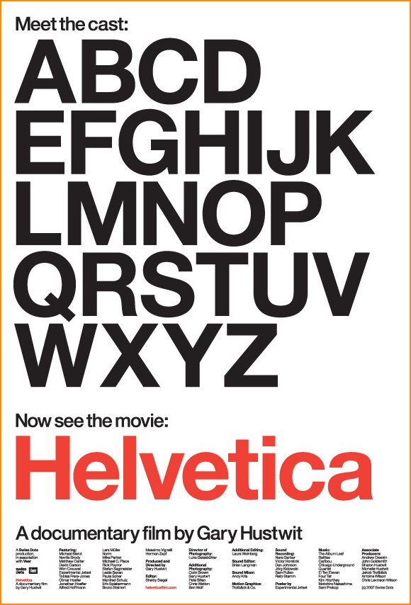
The font Helvetica is possibly one of the most famous and well-used fonts throughout history. It's sleek, timeless, & simple design makes it easy to read, user friendley, and design savy.

Gibson's points of view would be represented by a more hand drawn typeface. It may not be the most aesthetically pleasing or easy to read but it's an alternative and unique choice to a standard font. It has it's own personality which relates directly back to Gibson's views.

Learning Log 1: The Psychopathology of Everyday Things

Reading the first chapter of this book, I find myself being able to relate to the topics of functionality & purpose of a certain object or interface a lot. I have been living in the same apartment in Philadelphia for a year now. It is a beautifully renovated home with hardwood floors and a chandelier. But for whatever reason, my landlord doesn't know how or where to properly install drawers. With 3 girls living in a house, we use a lot of space with a lot of things. So the fact that our kitchen had many cabinets in it was a big plus. Problem was, the awkward installation of them. Our kitchen is a 3 sided room completely open on the 4th side to the living & dining rooms. In the left hand corner of the kitchen sits the range & a bottom set of cabinet drawers and doors.
There is one top horizontal drawer and one rectangular side swinging door.
Problem is, the range sticks out so far that you cannot open the top drawer all the way out. The person who built this disguised this mistake by putting some sort of lock device on the inside so you can only pull the drawer out far enough so that my fingertips can fit. The drawer becomes a decoration and this goes for 2 others in the kitchen and one in the bathroom. My landlord tried so hard to squeeze in all of this 'useful' stuff that he dismissed the actual functions of the objects themselves.